
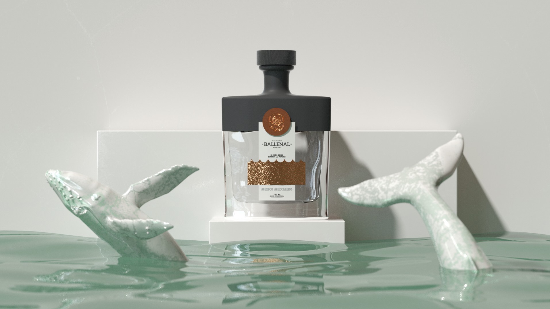
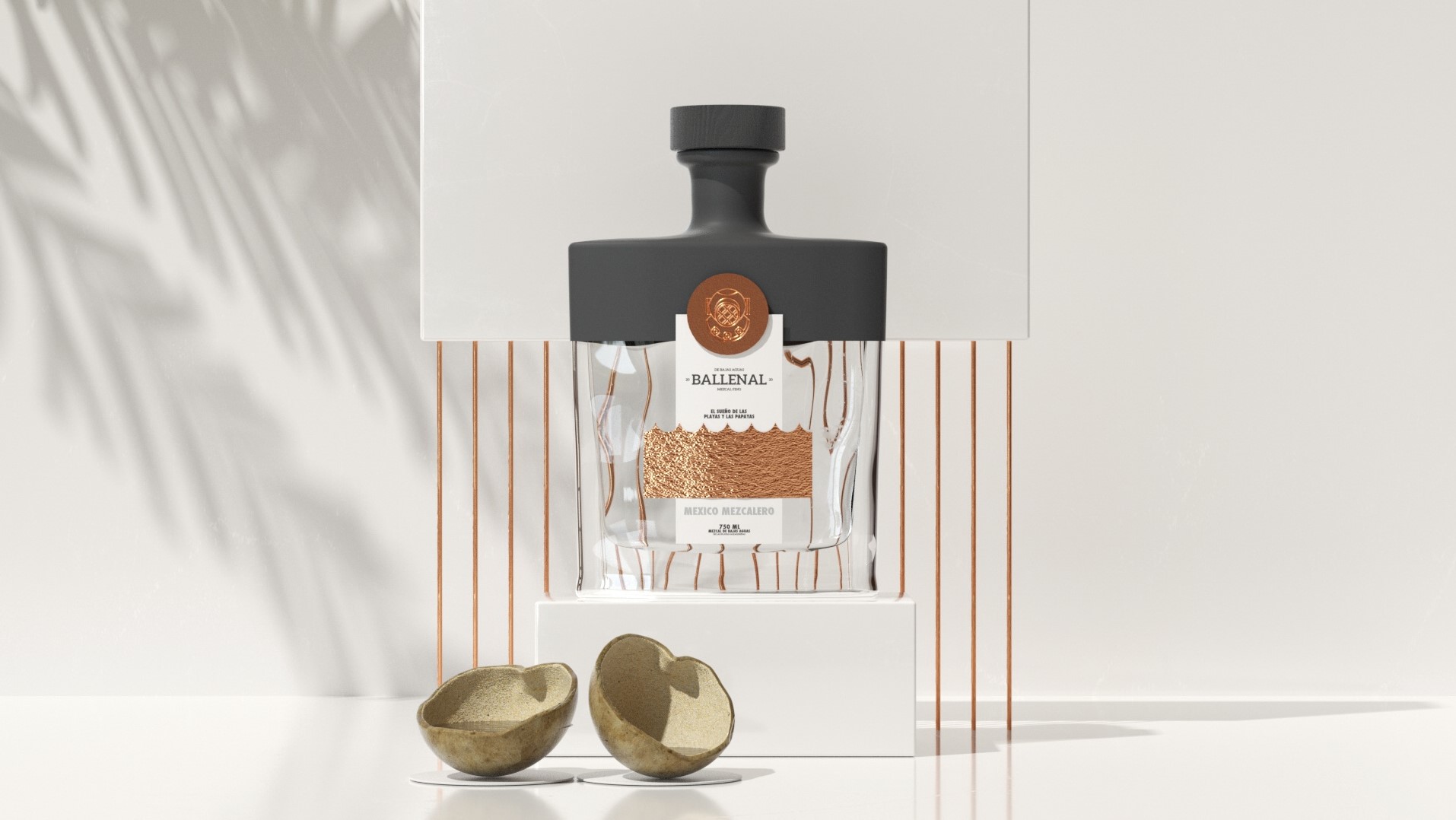
BALLENAL MEZCAL DE BAJAS AGUAS
Graphic Design
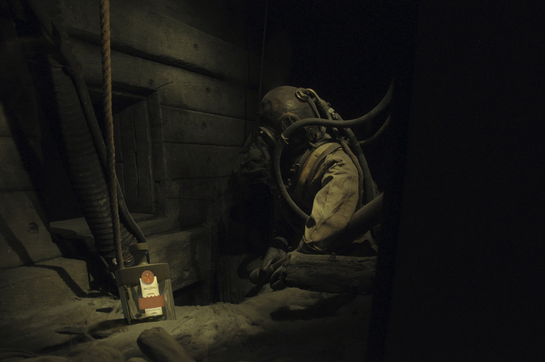
BALLENAL MEZCAL DE BAJAS AGUAS
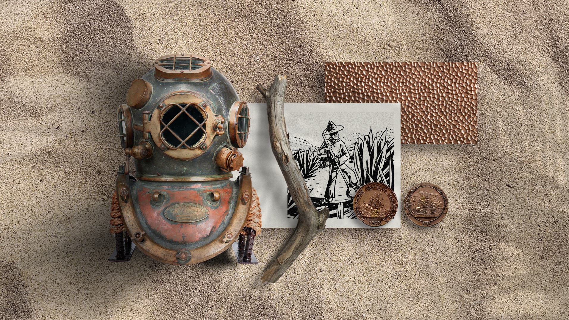
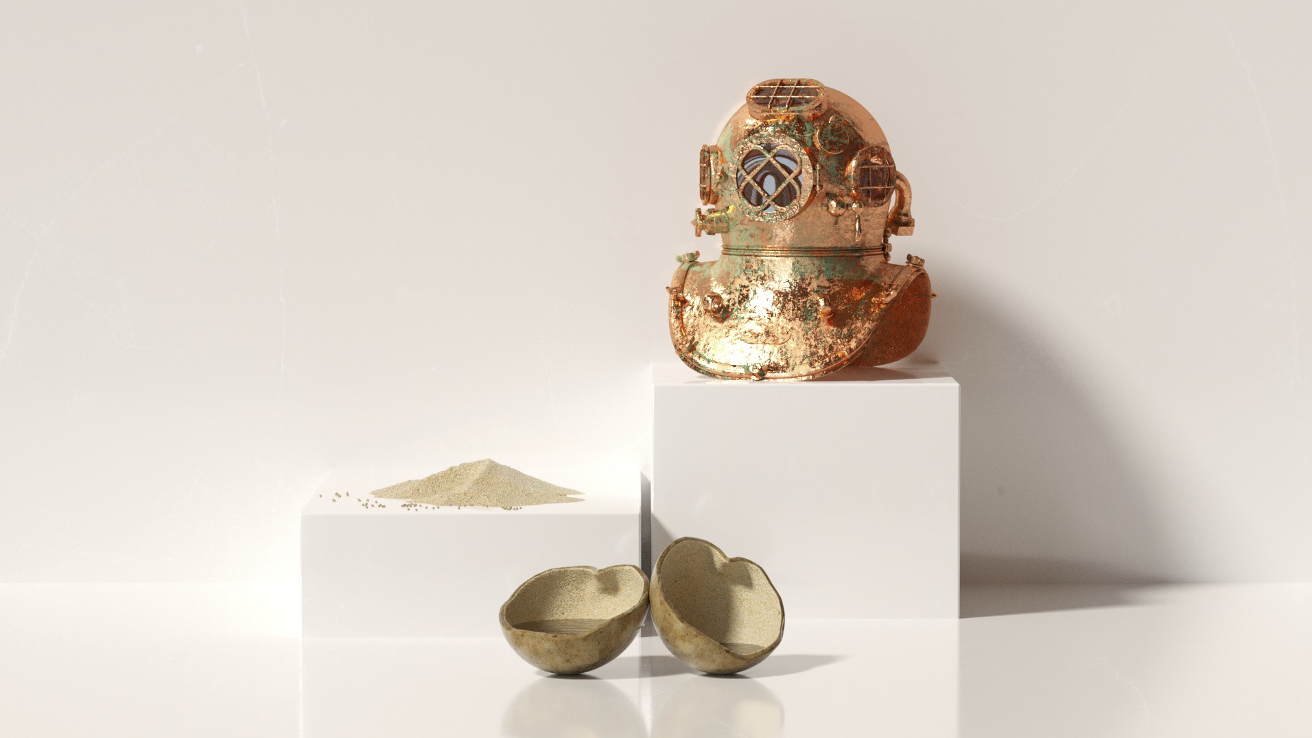
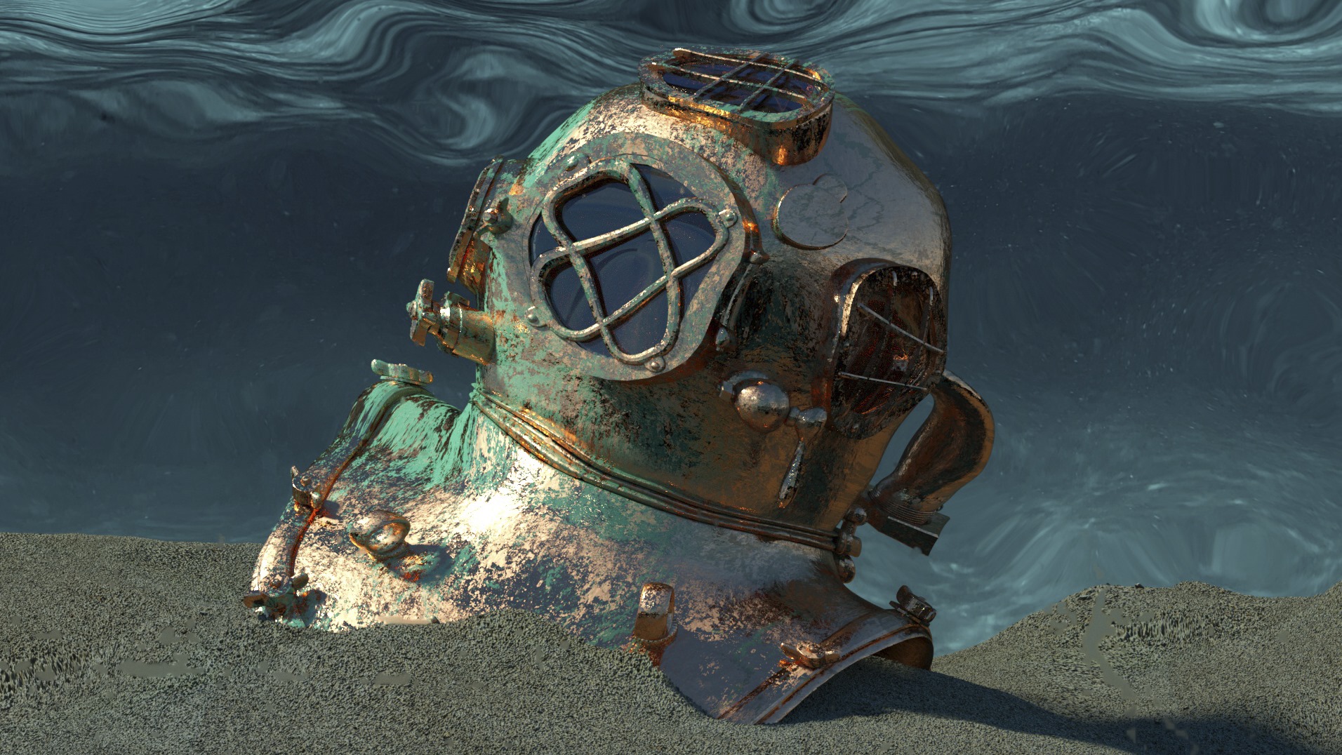
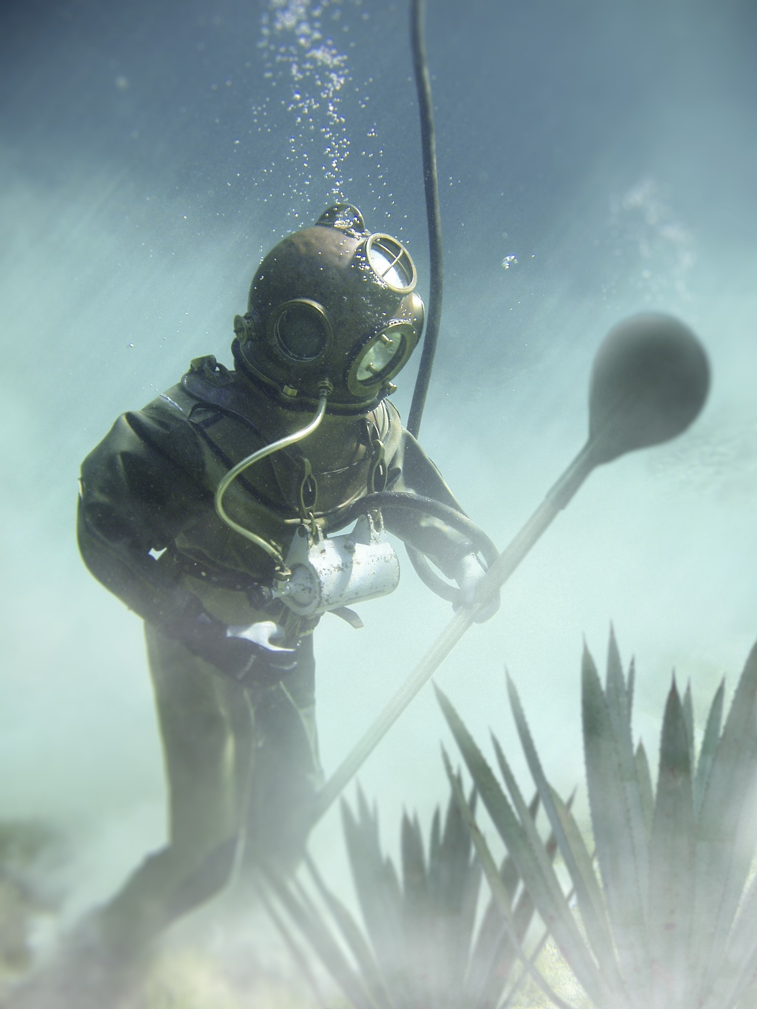
The inspiration for BALLENAL comes from Oaxaca beaches.
As a satire, allusion is made to a diver who went to PUERTO ESCONDIDO to look for papayas and the only thing he found was mezcal in the deepest part of the ocean.
The design aims to strike a balance between the crude and playful and the elegant, which was achieved through geometric compositions and the mixture of materials.
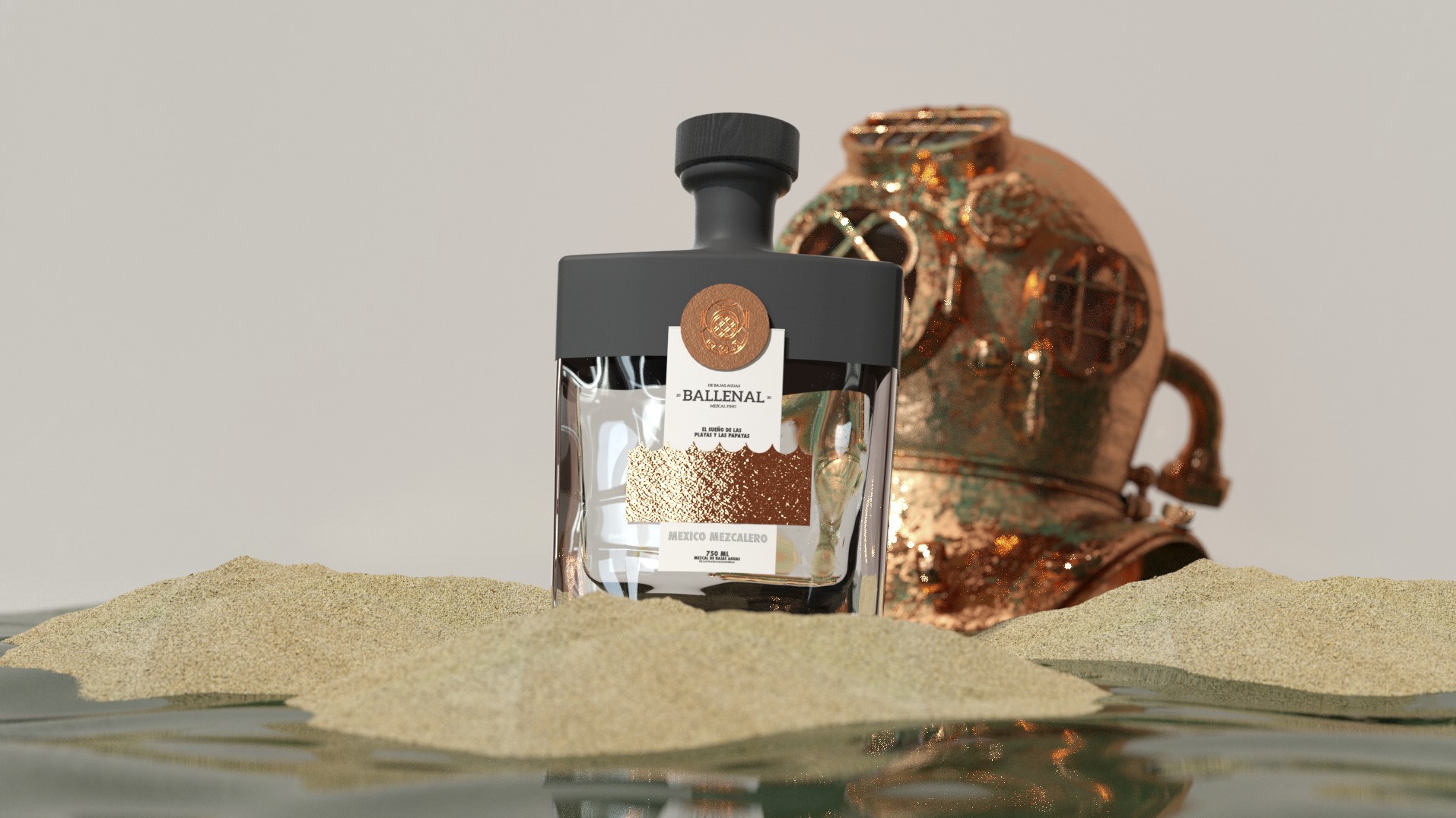
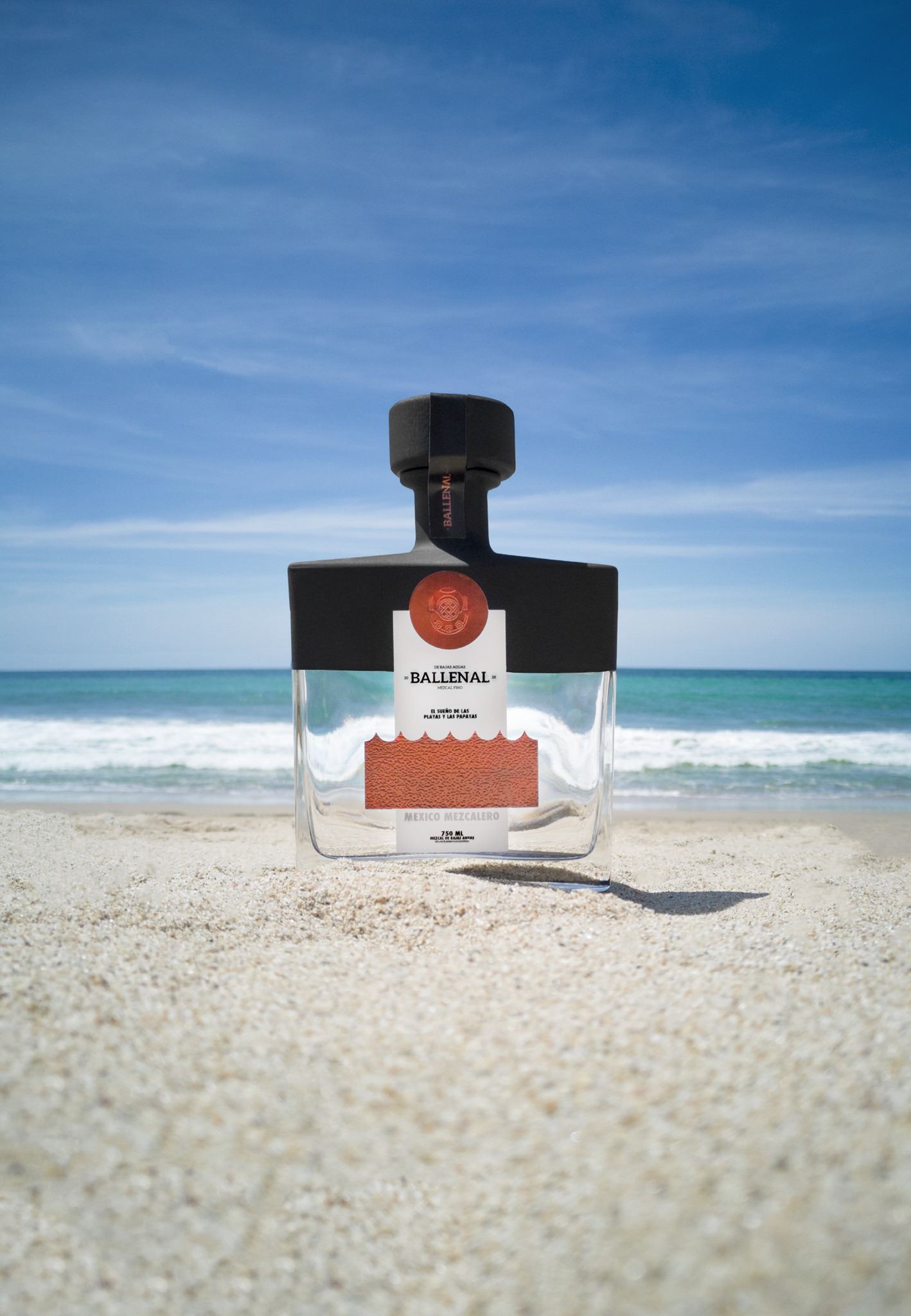
The label makes a play of volumes and textures that remind us of the hammered copper used in some crafts and the copper stills where the produces artisan mezcal.
The material that we selected for BALLENAL was SILVER FOIL EMBOSS as it allowed us and offered us the flexibility to land a concept, a paper that helped us to enhance the texture of the label, giving the project a visual and tactile sensitivity.
A symbiosis between materials, concept, graphics and bottle that invites us to
search into the deep of the ocean and dream about the beaches.
A symbiosis between materials, concept, graphics and bottle that invites us to
search into the deep of the ocean and dream about the beaches.


Thanks for watching!
![]()
![]()
![]()
![]()