
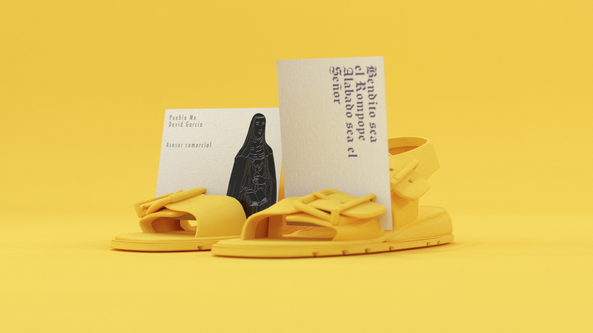
ROMPOPE SANTA CLARA
Graphic Design
ROMPOPE SANTA CLARA
Regardless of whether it is your first time or that you already knew it, the Santa Clara eggnog is a classic that will undoubtedly delight everyone who tries it. This slightly thick drink is ideal to drink on the rocks, and accompany one or more dishes. You can even taste this burnt golden-looking liquid as a dessert digestif. It is made from egg yolks, almonds, milk, sugar, vanilla, cinnamon, and a touch of liquor.
We redesigned the current graphic identity of rompope Santa Clara in order to generate an image that adheres to the needs of the current market, we made a synthesis of existing elements and we generated a new language for the brand in order to reach new markets.
Rompope Santa Clara is originally from the city of Puebla de los Angeles.
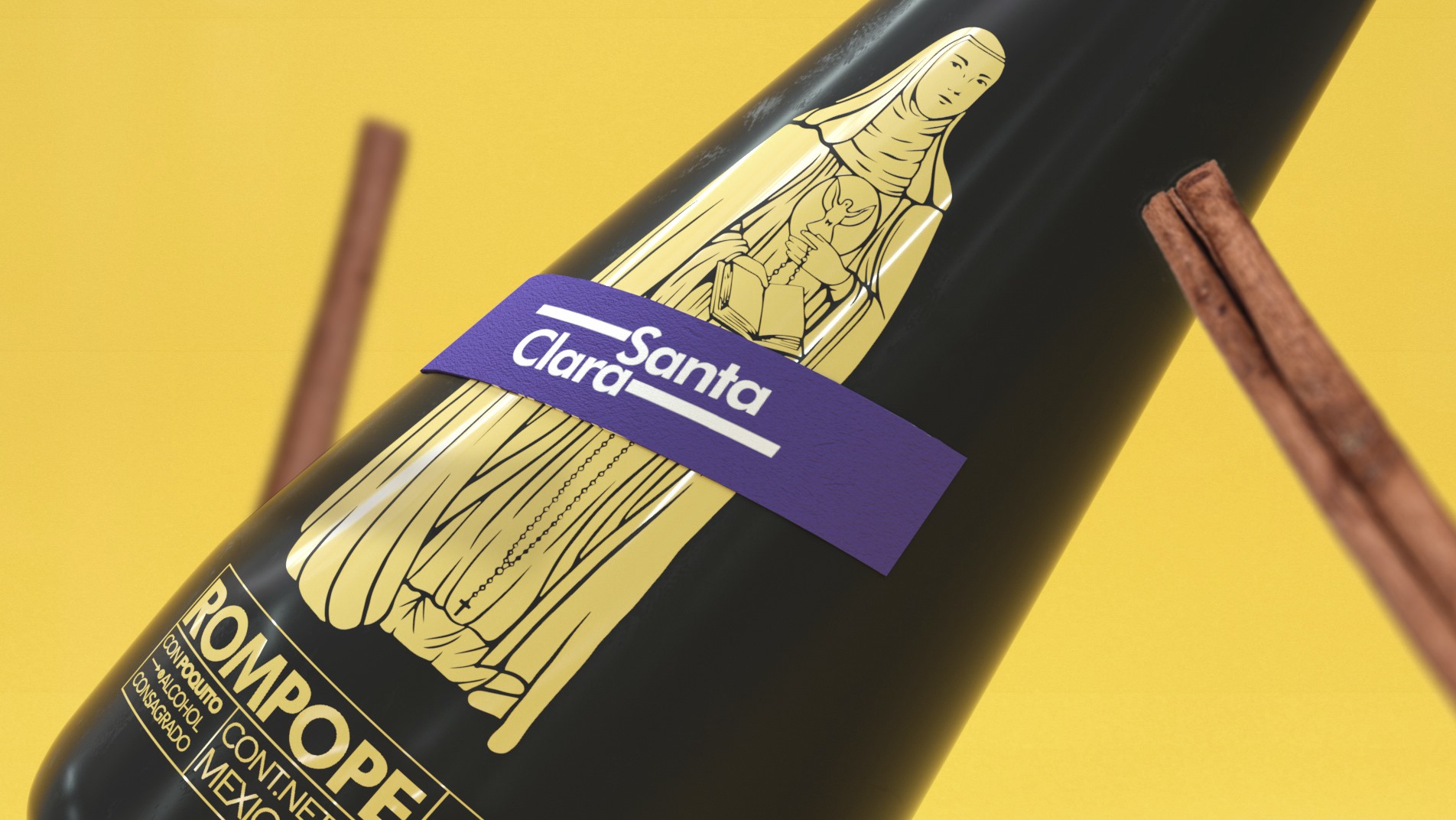
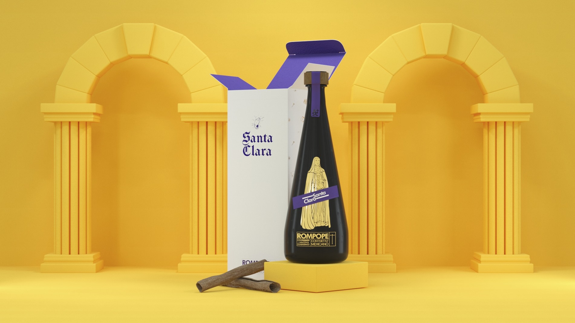
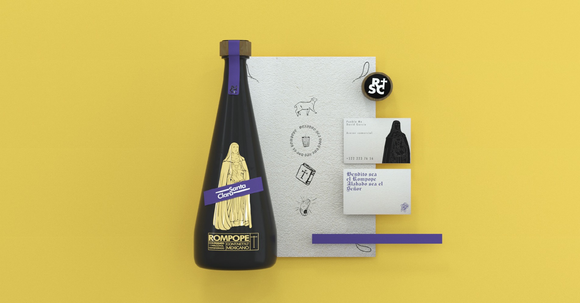
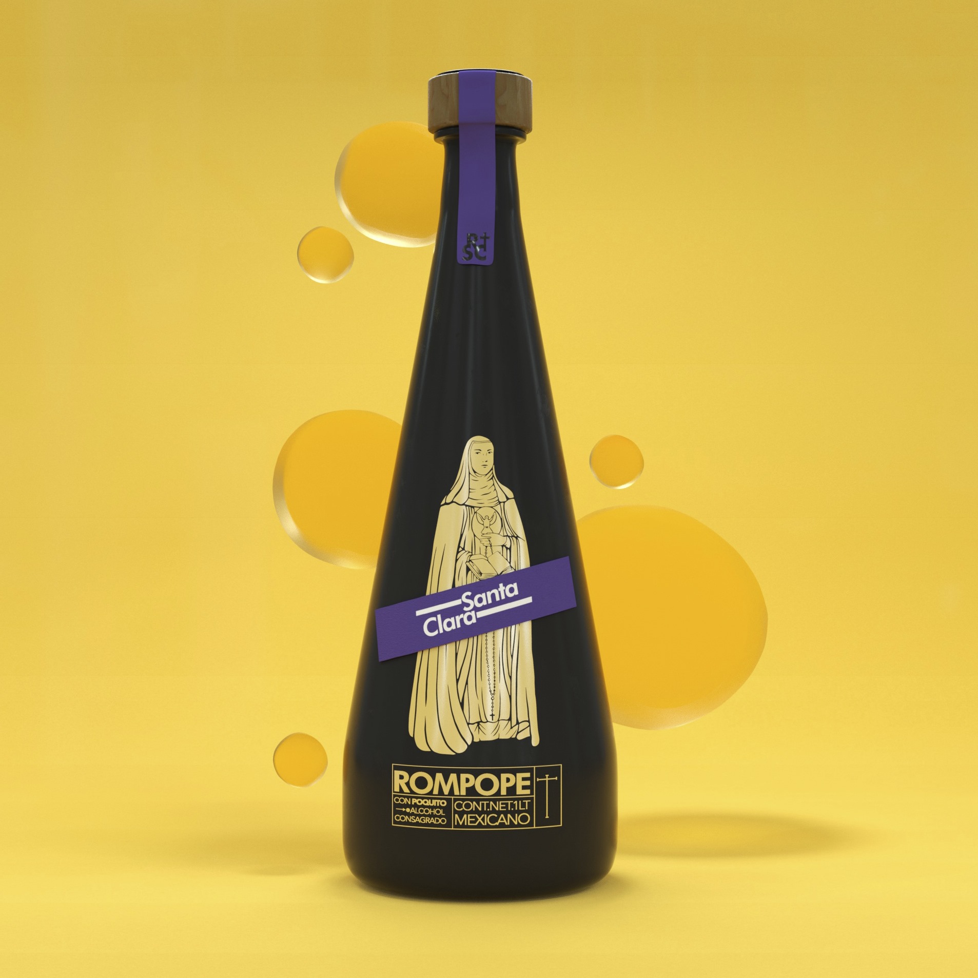
The bottle currently allows us to see the yellow color of the eggnog and has a label that shows the corporate identity with metallic red tones, we made a radical change for the proposal, achieving a balance between the traditional identity and the previous one.
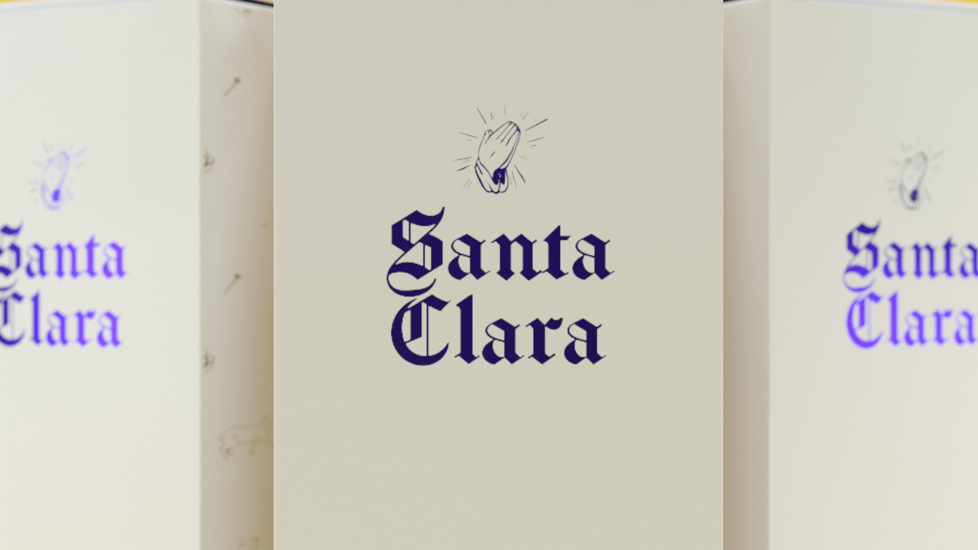
We cover the bottle in black and add purple to the project, giving the project a bit of mysticism. On the other hand, we took some Gothic fonts and made a mix of classic and contemporary fonts.
The bottle currently allows us to see the yellow color of the eggnog and has a label that shows the corporate identity with metallic red tones, we made a radical change for the proposal, achieving a balance between the traditional identity and the previous one.
We cover the bottle in black and add purple to the project, giving the project a bit of mysticism. On the other hand, we took some Gothic fonts and made a mix of classic and contemporary fonts.


Thanks for watching!
![]()
![]()
![]()
![]()